Atlassian Reverse Trials
TL;DR: I brought Jira and Confluence “Reverse Trials” to market for Atlassian, launching the initial experience as well as enhancing and improving the designs based on business metrics. The key focus of this project was strategic UI.
Hold on - what’s a reverse trial?
A reverse trial is a product-led growth strategy where a new user starts with full access to a premium (paid) version of the product for a limited time. After the trial period ends, the user is downgraded to a free/basic plan unless they choose to upgrade and pay to keep the premium features.
I launched the MVP for Jira as well as created a massive upgraded experience for both Jira and Confluence, continuing to iterate based on data with various experiments.
The Project
Our team had three weeks to launch Reverse Trials for Jira based on a successful Confluence MVP. At the direction of c-suite leadership, I pulled together designs fast for this experience, and then took 3 months after the initial launch to build out enhanced UX.
The Project
Our users enter the product via Atlassian.com, complete product onboarding, and have 30 days to trial the Premium plan. My objective was to design a flow that would meet three key user needs:
1️⃣ Help them understand that they are in a trial
2️⃣ Allow them to experience Premium features, and
3️⃣ Give them an easy way to take action

Ways of Working
My Role
Senior UX Designer - Ideation and Workshop Lead - Low, Mid, and High Fidelity UI - Research - Design Review - Developer Sync - Storytelling and Stakeholder Influencer
The Team
Senior UX Designer - Senior Principle Product Owner - 10 Developers - Visual Design Lead - Senior Leadership
Tools Used
Figma - Figjam - Loom - Zoom - Slack - Pen and Paper - ChatGPT
The beginning - design starting point
We had the blueprint for the design work in Confluence, and I scaled it to Jira using existing components. To do so, I used a mixture of ADS library, user research, creativity, mock up exploration, feedback from stakeholders and senior leadership, and working with developers to execute as quickly as possible.


Updating for Jira
In three weeks, we updated the designs for Jira using existing components in the Atlassian Design System.
Our key metrics were as follows:
XXX
We knew there was room to iterate and improve - one of my team’s specialties. So I re-designed the entire flow, updating key experiences.
Customer problem statement:
Business problem statement: TBD
Hypothesis: TBD
Target metrics:

Once I looked at competitor analysis, I pulled in existing research, insights, our persona, and our opportunities:

I then created a large strategic sticky note map of our overall strategy and how we wanted to approach solving the problem.

Finally, it was time to start mapping out the new journey itself. I started by writing everything down in a figma file…

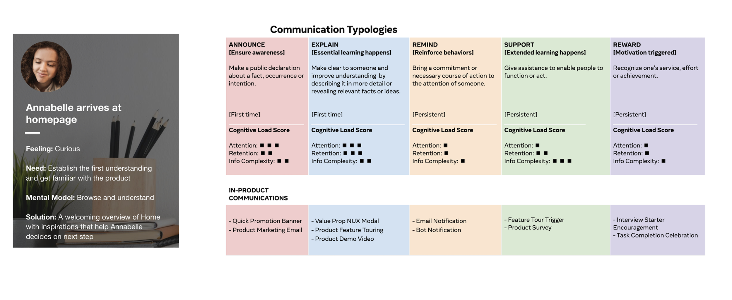
…and then I mapped to sticky notes and pulled in the user’s feelings, mental models, needs…

…and added in how we would want to express this visually.

I also used a UI comms strategy framework from a previous project to think about communication typologies, which is one of my structured ways to categorize how a product communicates with users. Kind of a taxonomy of all communication touchpoints, if you will.
Design Beginnings
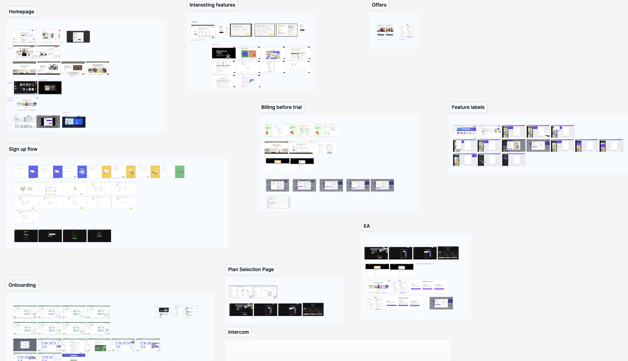
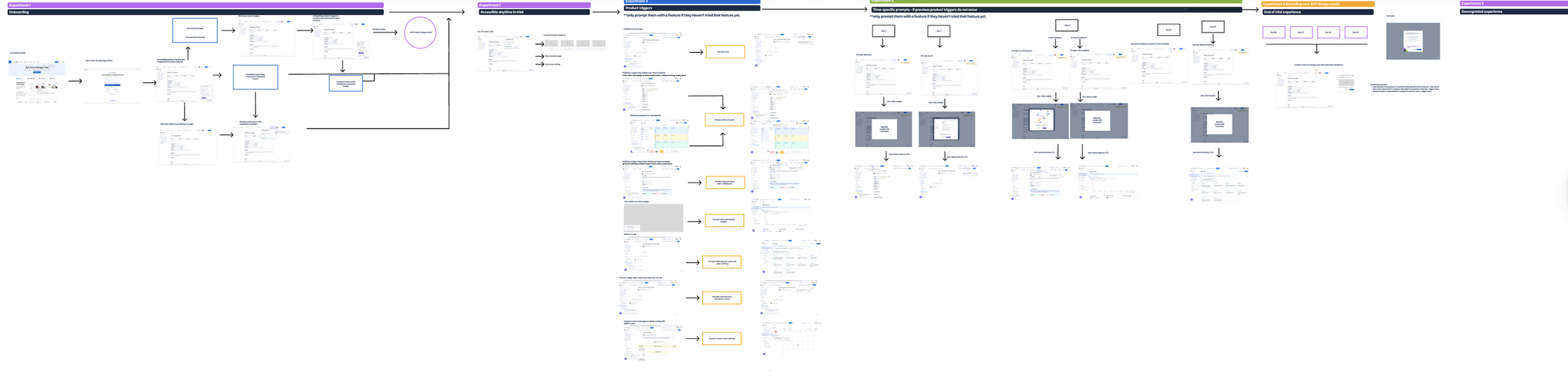
Finally, it was time to dive into the design work itself. I started out with some product user flows, wireflows, and playing with UI options to map to the taxonomy.


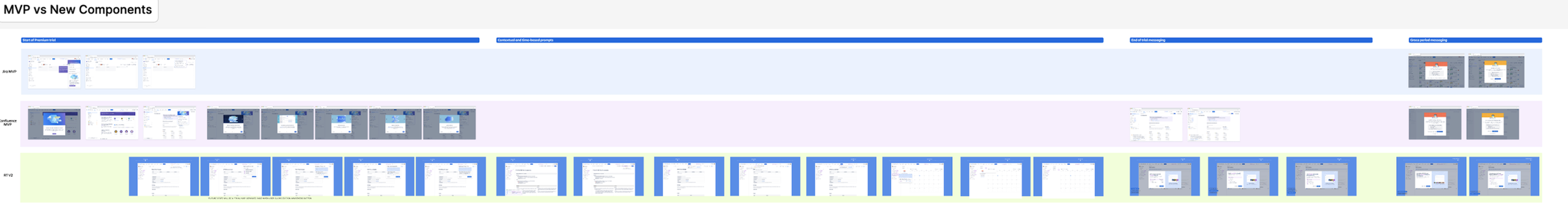
New designs vs MVP
What would the new proposed experience look like vs the MVP? Here’s a visual I created to showcase all of the changes side by side.
Final presentation and delivery
I solo-presented to our chief of design, Charlie Sutton, going through the 113 screen prototype in an hour long presentation. We got the green light to move forward with design implementation:

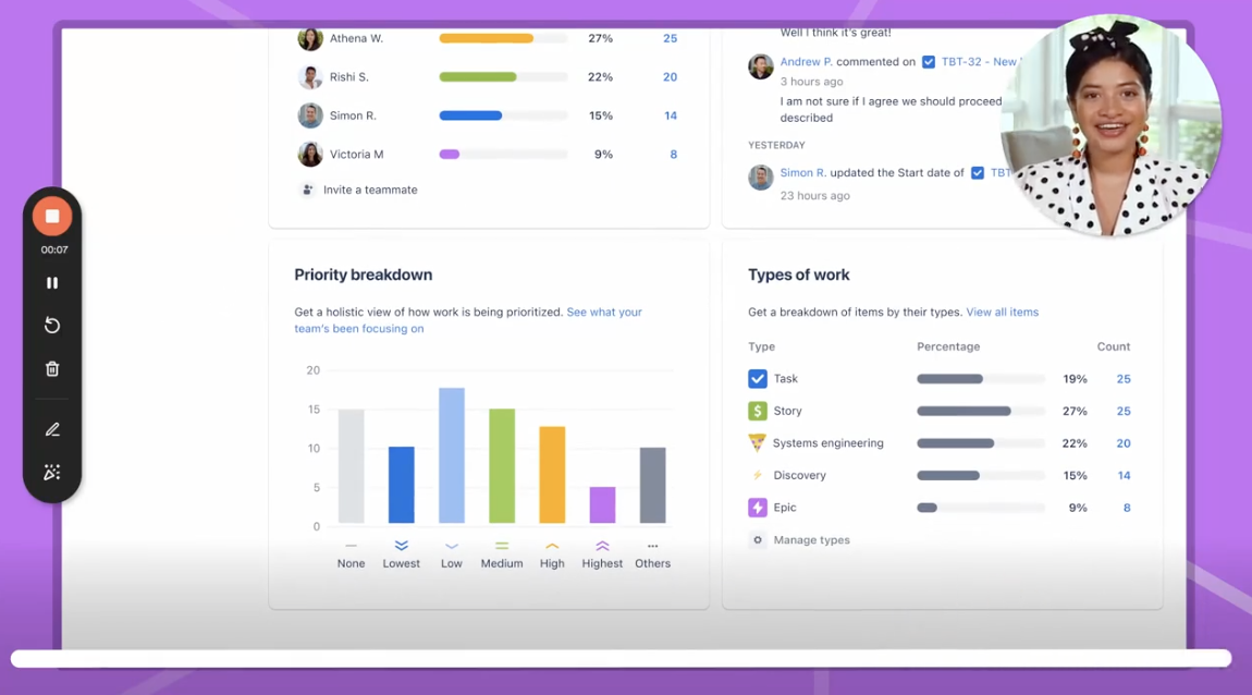
Here are a few screenshots from the flow to highlight the UI specifics:


Final results and next steps
Did a combination of quant and qual testing using intercom, Google’s H.E.A.R.T. framework, two quantitative SUS questions, and user interview follow ups
Key insights from the research included: wanting to understand reason for upgrade immediately, uncertainty around CTA
Project Results

25% uplift in purchase rate - project was launched in late November 2022
In Retrospective
It’s an art and a science to balance ship speed with design quality and user value. I had to learn what to compromise on (additional features) and what to stand firm on (design and premise of the page)
“You are not the user”: customer feedback is critical, and falling back on those insights as decision-making collateral is a sure way to make a strong impact.
Stay plugged into the business so that you can anticipate changes that may arise. A designer should never just be in “design land,” they also must be influencing stakeholder conversations and keeping an ear to the ground on the state of the business.
Additional Case Studies