Doctor Bio Design Update

🛠 Ways of Working
My Role
UX Research
UI Design
User Testing
Stakeholder Alignment
Product Owner
Product Delivery
The Team
Senior UX Designer/Product Owner* (Me!)
Front End Developer 1
Front End Developer 2
QA Developer
Back End Developer
Data Scientist
*our team was without a product owner for the entirety of this project, so I took on that role.
Tools Used
Figma
Jira
Confluence
UserTesting.com
Pen and Paper
📱Current User Experience
The current mobile header is crowded, lacks cohesion, and is not aligned with the brand’s updated UI guidelines.

To begin the work, I grounded myself in our two user personas.

⚙️ Research Process
For the research process, I began with a competitive analysis.

I also completed user research, including online interviews and surveys with 14 users who have visited a doctor recently.
My goal with this research was to understand the most important things to users when they look at a provider’s online profile.
Specifically, I wanted to understand user wants, user needs, and future opportunities.


Research Results and Insights included the following:
“Must Haves” include name, specialty, ratings, whether or not the doctor is accepting new patients, phone number, and location.
“Nice to haves” would be a telehealth callout, photo, and how to share and save that provider.
“Don’t Really Need” include a short bio, the gender, and the age.
The most important provider callouts include trustworthiness, explains conditions well, and easy to schedule.
🎨 Initial Mocks in Figma
My team typically works iteratively with mid or high fidelity mocks in Figma. For this project, I put together over 50 initial designs.
For reference, here is the brand’s homepage. I was attempting to align the mobile designs with this type of look and feel.

👨💻 User Testing of Designs
Next, I tested the designs via UserTesting.com and got a ton of great user feedback.
For example, users found X and X, and they also noticed X and X.

And of course, I wrote out the research findings in Confluence for easy sharability and findability across the organization.
(P.S. For how I standardized and updated Healthgrades’ research process, check out this case study!)


After doing the initial design testing using UserTesting.com, I made updates to the mocks based on my findings.
Here are a few examples of these mocks:

Next, it was time for another iteration of user research.
Here’s some visuals of the annotated research findings:

It was finally time to take the designs to my directors and VPs. I shared four design options with them to get their opinions.
A quick note here. Although “opinions” aren’t always what I strive to solicit in my designs, these four options had tested very well with users, and at this time in the project, it was appropriate and necessary for me to get stakeholder buy-in.

🧐 Edge Cases
After standardizing the design with users and stakeholders, I worked with my front end devs to design edge cases for all of the types of doctor profiles on the site. Here’s a quick list of some of the edge cases that I designed for:

And an example of an edge case mock.

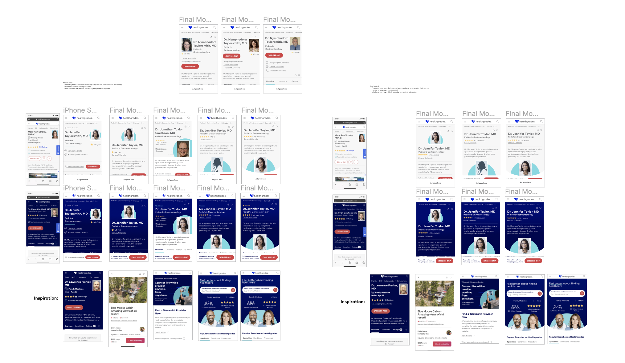
💎 Final Designs
Finally, the designs were complete.
✅ Stakeholder signoff
✅Dev o-k
✅ Brand (marketing) team alignment
✅ Clean Figma file


Additional Case Studies
-

Healthgrades Uesr Research Process
It all begins with an idea. Maybe you want to launch a business. Maybe you want to turn a hobby into something more.
-

Hello Package SaaS App
It all begins with an idea. Maybe you want to launch a business. Maybe you want to turn a hobby into something more.
-

Home Depot Visual Design
It all begins with an idea. Maybe you want to launch a business. Maybe you want to turn a hobby into something more.